Warm, Earthy Green
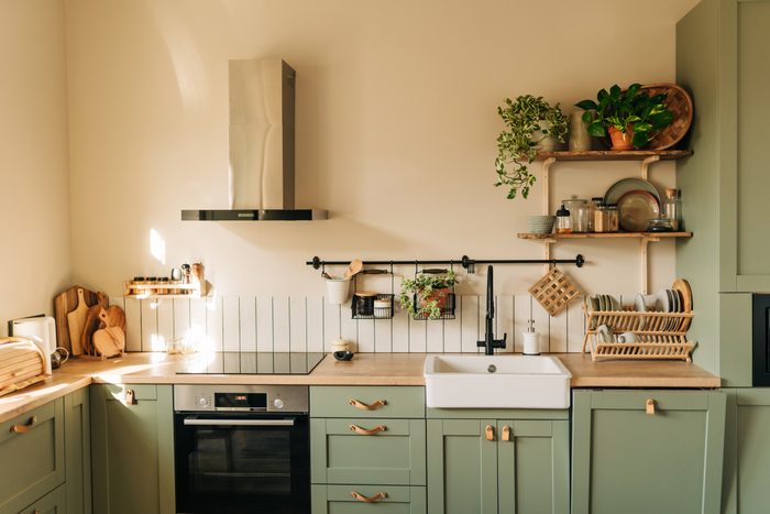
There are plenty of ways to use trendy greens that will work for your kitchen. You won’t go wrong with almost any shade of green, although sage-ier hues are trending hottest at the moment. Everything from rich, dark hunter green to light, peppy mint will look fresh and new.
Green could show up as wall paint or in a wall covering pattern. It can really take center stage as cabinetry paint, or even in countertops like green Rainforest granite.
Restrained Teal
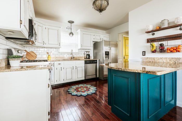
Teal is a jewel tone that continues to win over homeowners, but the undertones have changed since the last time it reigned supreme. Check out Glidden’s Color of the Year, Vining Ivy, for an updated version. A little gray tempers the richness.
Stefan Burcur, founder and owner of Rhythm of the Home, suggests the bold, beautiful Tucson Teal from Benjamin Moore. He recommends pairing this with a patterned or checkerboard flooring option, or gray or white cabinets “to complement the nuances and bring attention to a focal point.”
Navy Blue
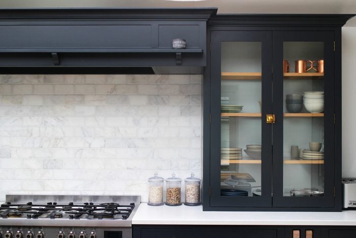
This color can appear dramatic or preppy, classic or sleek and modern. Lately, it’s been showing up on kitchen cabinetry. It pairs beautifully with brass or gold hardware, which shines against the dark backdrop. A good place to start is Benjamin Moore’s Hale Navy.
Golden Yellow
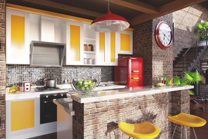
Kitchen appliance brand BlueStar is rolling with Pantone’s New York Fashion Week palette of bright, bold citrusy colors. From hot coral to lime green to “empire yellow,” these colors liven up any kitchen, whether as a bold accent or an all-over day glow treatment. BlueStar will color match for a perfect fit with your kitchen design.
Bluestar’s Ann Muth says, “While a specific color might not always translate the same into a kitchen, the overall aesthetic might. Clean, muted lines, soft and neutral colors, bright pops of color. Like most trends, we see them cycle and show back up every couple of years. This is true in fashion and at home.”
Black
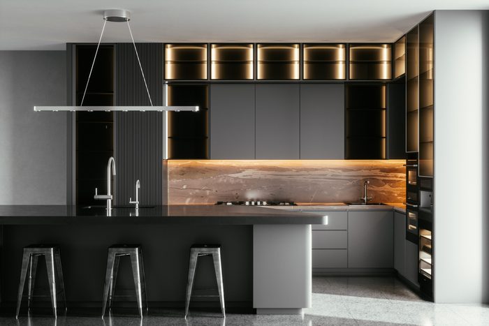
There’s nothing basic about black in a kitchen. It can feel super dramatic on high-gloss cabinetry, provide an exclamation point in backsplash tile or floor tile, or feel like a grounding element in plumbing fixtures against white farmhouse sinks. It’s all in the way you use it.
Lavender
Purples are trending in interiors, as are dusty pastels, so lavender becomes a sophisticated, natural choice. Homeowners are loving lavender now because it connects with nature and it’s more accessible than other, bolder purples.
It can be tricky to find the right lavender — refined rather than youthful or too candy-colored. Look for one with some gray undertones, like Dutch Boy’s Silvered Purple. Want a more dramatic look? Try a juicy purple, like Sherwin-Williams’ Fabulous Grape.
Bonus: Purple plays a perfect foil to yellow and green, also trendy kitchen colors.
Warm White
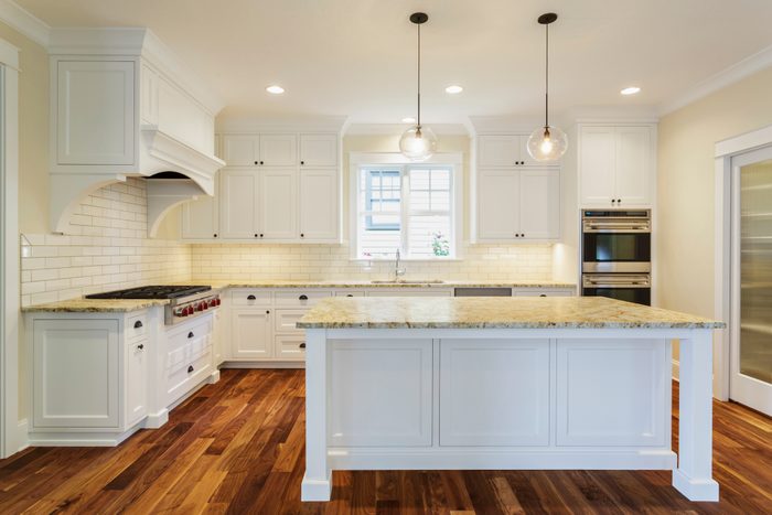
Whether you want a monochromatic look, tone-on-tone neutral palette or a cozy white with pops of color, warm white is trending strongly. One prime example is Behr’s Color of the Year, Blank Canvas. Jen Stark of Happy DIY Home suggests white, cream and/or light gray to brighten a space and make it feel more airy and open.
Orange
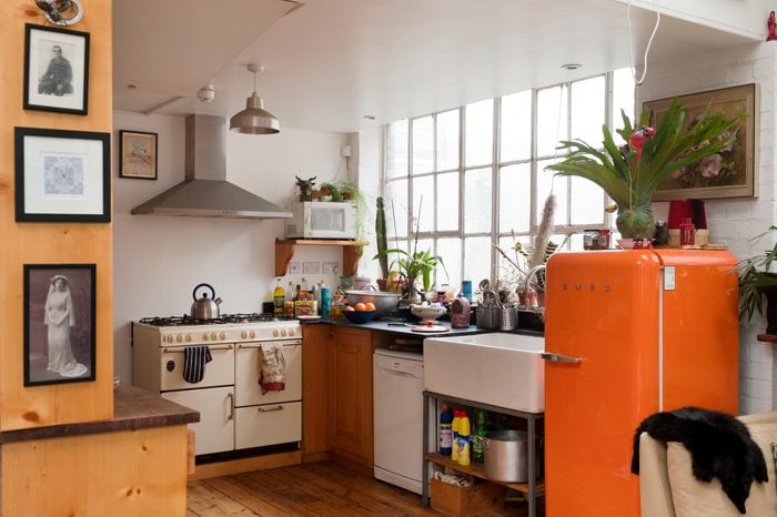
Underused and overlooked, orange is starting to turn heads. Pair it with white for a juicy-squeezed mid-century vibe. Or add green, another hot color, for a more natural palette. Stylemakers using orange are onto something; the paint company Backdrop chose an orangey hue for its Color of the Year, cheekily named Color of the Year.
Terra Cotta
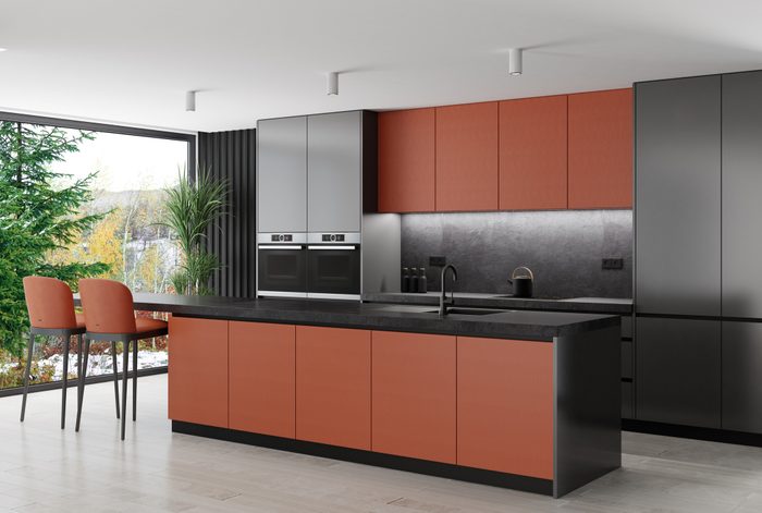
As Sherwin-Williams says in its Colormix Forecast, “rich earth tones, natural clays, sun-baked sands, restful neutrals and powdery pastels” will take center stage as people continue to reach for a sense of groundedness connected to the natural world.
Risk-takers might paint their cabinets a bolder coral, like Lei Flower. Others may be more comfortable with one accent wall in a neutral beigey pink, like Malted Milk. Sherwin-Williams is putting its biggest bet on its Color of the Year, Redend Point. Make that your design North Star if this color category feels right to you.
Rust
As design choices turn toward 1970s color palettes again, think rust or wine tones to pull into your kitchen. Graham & Brown’s Color of the Year, Alizarin, could be a dramatic accent color on a kitchen island or as a bold statement on all the walls. It pairs well with Graham & Brown’s floral wallpaper, Florenzia Dusk, which pulls out green and gold hues as well.
Graham & Brown Design Manager Maryanne Cartwright says, “It’s an alternative to the gray and beige shades that have grown wearisome. It can be used in small spaces to create a cocooning effect or in larger rooms to transform the space into an opulent abode.”

